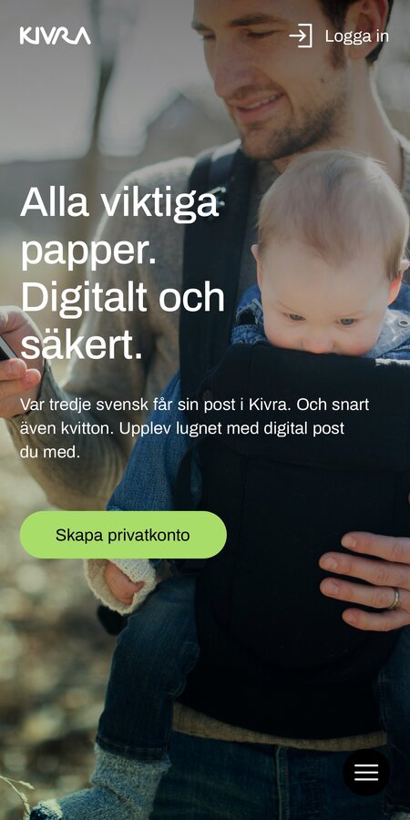
With a 90 percent market share, Kivra is Sweden's no. 1 digital letterbox. Recently appointed one of Sweden's most purposeful digital services, and with a number of new services in the pipeline, Kivra was in need of a re-defined and clear visual presence.


In order to strengthen the brand and build for a consistent experience, all focus was shifted towards the green color. Shades of lighter green makes for a bright green experience while ensuring sufficient contrasts with black text.
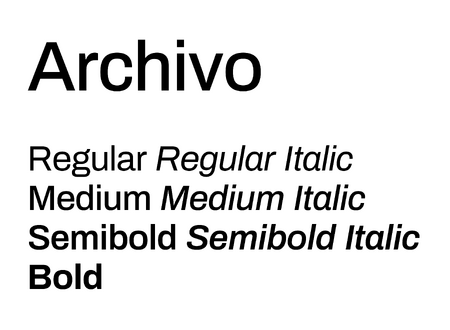
A mix of more generic typefaces were replaced with a single, more characteristic one – emphasising the simple, modern, friendly and reliable nature of the service. Optimized for both digital and print, and readable and clear even in small sizes.




A new set of imagery focuses on what Kivra actually does for you – creating an easier and paper free living, where everything important is always with you.
A Kivra-unique filter gives photos a distinct look, making them easily recognisable even with a minimum of branding.
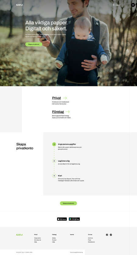

Complex processes call for simple explanations. A set of friendly and simplistic symbols, complements the identity and guides users on features and attributes.
